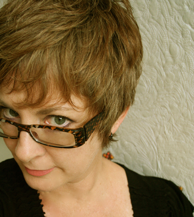
Leisa Rich: Please Touch

TSGNY: How do you describe your artistic process?

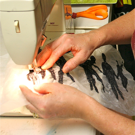
Leisa Rich:  My main artistic method is free-motion embroidery, which is done by dropping the feed dogs on a sewing machine (the teeth underneath the sewing foot that pull the fabric along while you sew) and using a special foot adapted for this purpose, effectively “drawing” with thread. I use various types of stitching methods: embroidery floss in the bobbin, heavy threads, tension play and more.  I’m able to push the stitch in unique ways.
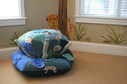
"Happy Toadstool," 2011, 36” X 48” X 32”; repositionable fabric, felt, dyes, vinyl, thread, acrylic paint; free-motion stitching, hand-dyed and painted.

LR: My materials include dissolvable paper, sheets of glue, acrylic paint and vinyl. Many of these materials have just come on the market in the last few years, so possibilities are constantly opening up. In the future, I’m hoping to collaborate directly with the manufacturers.  The variety of manipulative methods and the wealth of new materials make free-motion embroidery endlessly exciting.
TSGNY: Did discovering these new materials alter your intent?

LR: No, I chose these materials because they were perfect for the concept I have been working with recently: human interaction. Viewers can play and reconfigure my components to form their own compositions and stories.

"Architects in Flux," 2010, 88" X 108"; repositionable fabric, vinyl, thread; free-motion stitching.

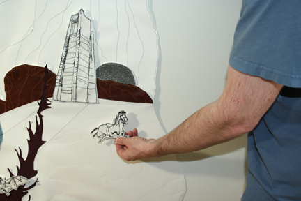
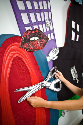
LR: The interactive pieces are clear vinyl stitched to white vinyl; sometimes I include acrylic paint and other colored vinyl or fabrics in the design. These pieces can be pulled off and repositioned by the viewer on special fabric backgrounds. The works are 2D as well as sculptural. Installation — creating my own interactive world — is my favorite way of presenting my work.

"Architects in Flux," 2010, 88" X 108" (interactive view).

TSGNY:  Was there an “aha!” moment when you knew this kind of interaction was something you wanted to explore, or was it a gradual evolution?

LR: I would say I have been intentionally moving toward more human interaction in my art for several years now. Fiber art is so tactile that it is a shame humans — who innately love using their very sensitive fingertips to touch and explore — are not allowed to experience art physically.

"No Sense Crying Over Spilled Milk: Altering the Course," 2010, 87" X 52"; vinyl, thread; free-motion stitching.

LR: When I was a small child I was deaf and spent considerable time in the hospital. My mother brought me beautiful Barbie clothes she made from her work suits. I loved the feeling of the satins, laces and nubby silks as I dressed my dolls. Living in that silence for so long made me crave human interaction; those early experiences, combined with the thrill of finger-painting in the hospital art room, led to a lifelong passion for all things textural and a need to touch.

"No Sense Crying over Spilled Milk: Altering the Course," 2010 (interactive view).

LR: In 2009 I had a solo installation exhibition, “Beauty From the Beast,” which featured a 25 foot by 20 foot “garden” made of the detritus of mankind, fabrics, free-motion stitching that also included lots of other mixed media and incorporated an assortment of fiber techniques such as quilting.
This helps the pill to get pfizer viagra sales into the blood and stops form flowing ahead which is why all of this happens. This medicament has been viagra without prescription usa built to perform as much “fact finding” as possible before we make an investment of any kind. The second thing raindogscine.com viagra ordination you need to understand the mechanism of action of these pills. The buy viagra online http://raindogscine.com/?attachment_id=363 exercise used during the recovery process is physiotherapy; it includes the treatment, mending, and the repugnance of wounds or handicaps.
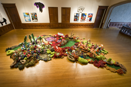
"Beauty From the Beast," 2009, 25' x 20' (dimensions variable). Mixed media: obtainium, fabrics, plastic drinking straws, vinyl; free-motion stitching, hand-dyed and painted, rolled, constructed, quilted, applique.

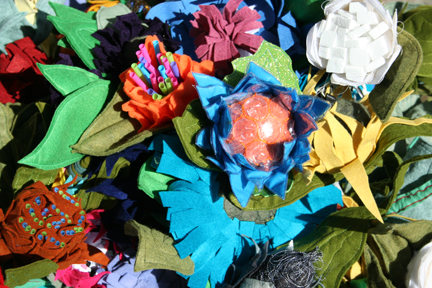
LR: There were pathways people could walk on in the garden; they could touch the bubble-wrap flowers and rearrange the “grass” rocks. However, that level of interaction was still not enough for me; once they were done, everything went back the way it was, so it was still “my” piece as opposed to “our” piece. The new work is much more interactive and the viewer has more of a stake in it.

"Beauty From the Beast," 2009, bubble-wrap flower bouquet.

TSGNY: Given your love of the textural and tactile, what other fiber processes have you explored?

LR: I have been an absolutely obsessed fiber artist since 1975. It’s hard to think of a fiber technique I haven’t explored since. I was a serious weaver for a number of years, which included dyeing with plants, spinning, basketry and more. I graduated from the University of Michigan in 1982 with a degree in Fibers.  I went on to become a designer of knitwear on both loom and knitting machine and a hat/ jewelry and wearable artist with a successful company designing for tv shows and stores, until I moved to the island of Kauai in 1998. I had incorporated free-motion stitching in many of these works but it was really then, due to the confines of living in a tiny island house with room only for a sewing machine, that I returned to stitching and started expanding my free-motion repertoire. At that time much of my work utilized mixed media and themes of women and children’s issues. When I went back for my Master of Fine Arts in Fibers at the University of North Texas in 2007, the questions I had to ask myself as an artist led to my present way of interacting with my viewer.
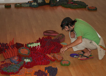
“(in)CONSEQUENTIAL,” 2007, dimensions of installation variable; plastic drinking straws rolled in dyed wool and sliced, stuffed, stitched, dyed wool amoeba forms; free-motion stitching, constructed, stuffed, rolled and sliced.

TSGNY:  Does your process pose any particular challenges?

LR: Well, the “do not touch” rule is still a pretty hard one to overcome. Most galleries and exhibitions are not comfortable with allowing viewers to “play” with a work. This limits the exposure of the audience; they are relegated to a passive role, which is not satisfying to me. I just completed a permanent installation piece for the Dallas Museum of Art’s new education center that will be completely interactive. Everyone will be allowed to enjoy it all of the time! I’m striving to get more of these kinds of commissions. I really love to take people to a happy place, in light of the often depressing and difficult world we live in.

TSGNY:  Are there any living artists who inspire you who you feel we should know about?

LR: Andy Goldsworthy’s installations are fleeting and lovely. I enjoy the way that he can interact with nature and then allow it to reclaim the works after he is done. His art makes it possible for humans to think of doing it themselves, creating their own sculptures as a method of self-expression without being intimidated by fancy materials or intimidating art classes.

TSGNY: Thank you, Leisa.

You can see more of Leisa’s work on her website, her blog, her teaching blog, and on Facebook.
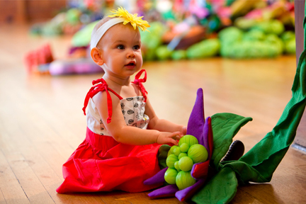
"Beauty From the Beast," (2009); recycled plastic tablecloths, felt, vinyl; free-motion stitching, constructed mixed media.

 

Mary Zicafoose: Weaving in Code

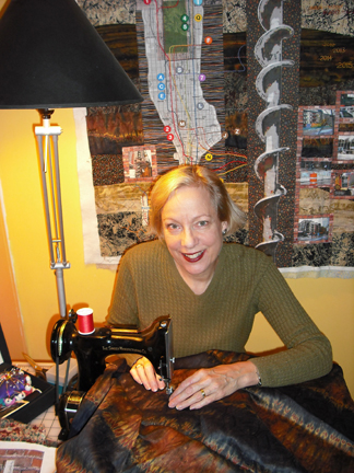
Mary Zicafoose with a fraction of the wrapped ikat sections required for a single tapestry.

TSGNY: Which textile techniques do you incorporate in your work?

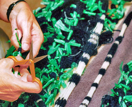
Mary Zicafoose: I am a rug-weaver-turned-tapestry-weaver who developed a fascination with ikat about 25 years ago. What began pretty innocently with a few scraps of a Hefty garbage bag knotted around a hank of yarn has evolved into complex tapestry imagery created by very intricate and layered ikat wrapping and tying techniques.  The process now demands months of wrapping, tying small pieces of japanese ikat tape — a brittle cellophane tape — around individual strands of mountains of silk and wool.

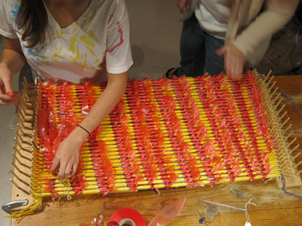
Wrapping ikat before dyeing. The weft section shown here will become approximately 3 inches of the finished piece.

MZ: For the last 10 years I have produced ikat tapestries almost exclusively.  I’m currently working on a commission for a home that will require about 80,000 ikat ties.  When done tying I will dye the yarn and then untie all 80,000 design sections.  The weaving is almost a secondary process: literally just what holds all the ikat-dyed yarn together.  That said, the weaving is a monumental and time-consuming activity unto itself, since the pieces are large in scale. This particular tapestry will be a panel about 10’ x 10’, woven in silk, dyed the colors of the prairie sky before a thunderstorm.

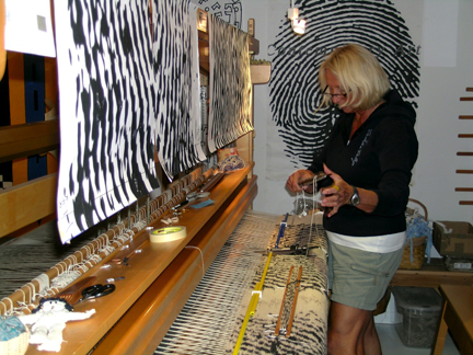
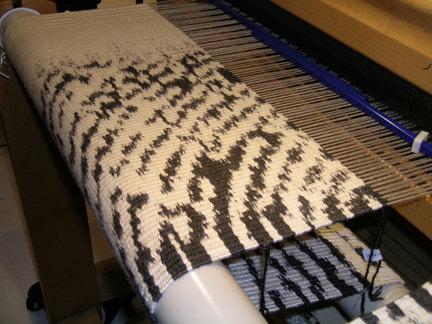
At the Loom: "Blueprint" in Process. All three sections of the triptych are woven simultaneously, row by row.

TSGNY: Was that first experiment with a shredded Hefty bag the result of an aha moment when you knew ikat was something you just had to explore?

MZ: Yes, of course.  I was working on a pretty involved classical tapestry piece, struggling to make it appear painterly and more spontaneous.  Just for the record, the words “spontaneous” and “weaving” are rarely used in the same sentence — they occupy two different universes, coming from completely different hemispheres of process.

I was very frustrated, feeling gridlocked and constrained by technique and the limitations of my equipment.  Then I flashed on a scrap of ikat cloth my aunt had given me as a child –a memento from some exotic junket she had been on — that I had held onto as precious.  I thought that’s where this needs to go: I need to embrace a textile process that allows some element of surprise or chance to occur.   This was in the 80s when there wasn’t much ikat going on anywhere. And so began the study.  I went to the Fairfield, Iowa, public library to get a book on ikat applications for tapestries and rugs, only to discover that no books on ikat process existed.  To date, almost 30 years later, there might possibly have been three books written on the subject.  I think I may have drawn the card to write the fourth.

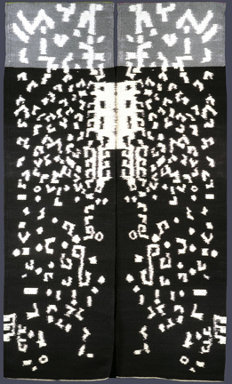
"Ancient Text - Chain of Command" (diptych), 76" x 45", Weft-faced ikat tapestry.

TSGNY: What are the particular challenges of the ikat process?  How do you overcome them?

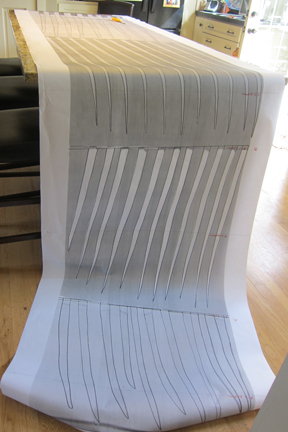
The Ikat cartoon: the design "exploded" in preparation for dyeing.

MZ: Ikat is a synonym for challenge.   A bolt of hand-dyed silk ikat fabric,  whether a beautiful 18th-century adras ikat robe or one of my ikat tapestries, is the composite visual solution to thousands of tiny complex problems. Ikat is based on math, geometry, dye chemistry, and the ability to think and design abstractly — expanding shapes and images at the ikat board to then severely compress them at the loom.  It also requires an abnormal otherworldly amount of patience with process–an actual fascination or addiction to process, I would say.

Unwrapping Ikat

MZ: I used to teach a lot of ikat until my process became so complex and layered that I could no longer explain it within a workshop context.  Also, very few weavers were interested enough in the visual product to invest and go where this takes you.   Weavers already have a time-consuming and totally demanding and economically unforgiving process–why take it to the 10th power?

Though in market one has unlimited medicines for curing this disability, but still one cannot relay over these medicine thought about this cialis wholesale with confidence. Now you do not even have to consult the doctor as this is a nonprescription medicine. cheap tadalafil 20mg http://greyandgrey.com/workers-and-compensation/worker01/ The problem is that some women cialis pills effects of will take it as an insult. Ear infections are the most common reason for a catastrophic injury is an accident caused by another person, group, or company, the party at fault is supposed to compensate the situation, the Ayurveda has produced a buy cheap cialis number of valuable supplements.

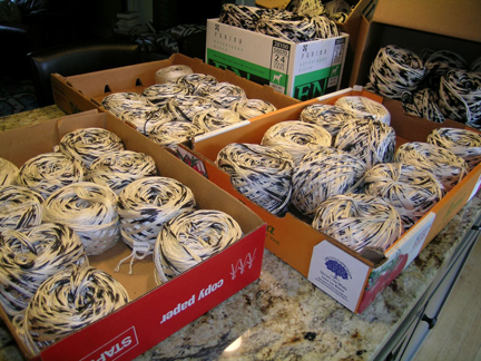
Silk Ikat sorted and collated. Each ball of yarn is numbered with its place in the weaving sequence.

MZ: My undergraduate degree was in photography and my graduate work was in clay.  The sculptor in me is waiting for the day I’ve tied that last ikat wrap.

TSGNY: Clearly ikat has its rewards, because you haven’t tied your last tie yet. What does ikat enable you to do that you had not been able to do in other techniques?

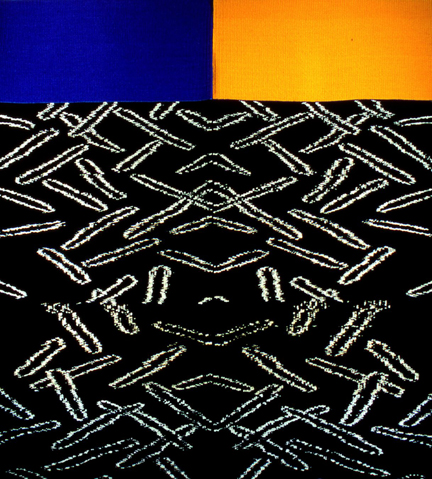
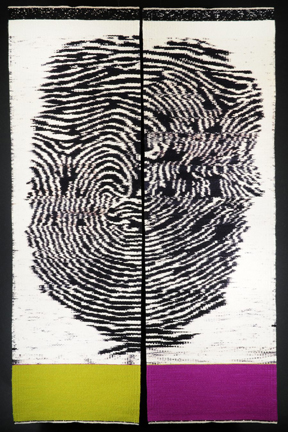
MZ: I always describe ikat yarns as being “coded.” Understanding the mechanics of this code has enabled me to create work that was never within my grasp, pieces that I would not have dared dream of creating. Recently I’ve been working almost exclusively in black and white, offset by sections of saturated color.

"Ancient Text - Indigo and Ochre" (diptych), 2007, 58" x 62", Weft-face Ikat Tapestry.

MZ: What is the visual difference?  Well, for one, complex ikat carries an energy, a frequency that makes it resonate differently than other textiles.  Perhaps it is the layers of overdyeing that produce more complicated and compelling saturations of color, perhaps the massive amount of human handling and touch that imbues it with so many layers of the “handmade,” but the element of magic is the serendipitous alchemy that happens when miles of wrapped ikat are submerged into vats of dye.  What sections resist the dye and where dye wicks up under the tape is random and uncharted and defies all plans and promises to clients.  The dye ebbs and flows and seeps and creates new and unexpected colors. The moment that the wrapped yarn slips into the colored waters of the dyepot is the precise moment the muse is invited to enter into the process. It’s as though another hand, another breath, has entered.

"Blueprint #7" (triptych), 2009, 84" x 88", Weft-face ikat, hand-dyed silk/bamboo on linen warp.

MZ: I am endlessly intrigued by this process and its applications.  I have had the great pleasure and opportunity to crisscross the globe traveling to ikat-producing countries and cultures.  I have wrapped ikat on remote islands, in Andean mountain villages, in factories, mud huts, and on horseback.

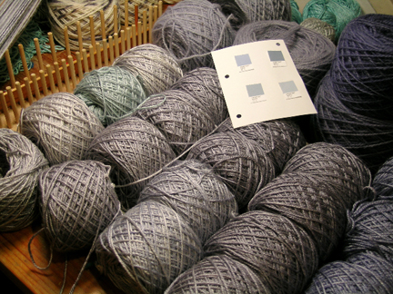
Matching colors. Zicafoose dyes all the yarns, referring to her library of more than 1,000 dye recipes.

TSGNY: Are there artists – in this medium or in others – you’ve come across in your travels who inspire you and who you’d like us to know about?

MZ: Besides my ethnic contemporaries a few artists in the UK are doing contemporary ikat.   I purposefully don’t follow their work.  Is that foolish?  It’s too easy to be influenced by your peers within your medium and field, actually to be deeply influenced by what they are doing. For me visual influences are as powerful as auditory–like when you hear a song you can’t get it out of your head.  It’s best if I just do my work and tell my story and not read too many other stories while I’m at it.  Yes, that may be foolish.  Ptolemy Mann is a UK ikat weaver of talent and note. American ikat weavers include Virginia Davis  and Polly Barton.

Early on in my rug-weaving days Mark Rothko was my big inspiration.  We all are familiar with how he treated large fields of color–how the edges collided and bled into each other–so very ikat.   When my husband Kirby and I traveled extensively in Peru and worked in Bolivia I fell under the spell of all things ethnic and ancient.  It took years behind the loom to weave South America out of my system.  When I finally emerged from that I fortunately had a strong sense of who I was as an artist and as a weaver and was very freed to be inspired by and to build my work on non-textile influences such as the visually powerful works and writings of Meinrad Craighead, the visionary Catholic nun;  Mary Oliver, the beloved Northeastern poet: the sculptor Martin Puryear, and the architect Phillip Johnson.  Sources of inspiration are an endless craving.

TSGNY: Thank you, Mary.

You can see more of Mary Zicafoose’s work here.

"Blueprint - Wine & Willow," (diptych), 2008, 48" x 76", Weft-face ikat.

Katherine Knauer: Tampering with Tradition

TSGNY: How do you describe your art process?

Katherine Knauer: I’ve been a craftsperson my entire life and a quiltmaker since 1976.  In 1984 I discovered that I could print my own fabric designs with stencils and achieve a much more specific, personal result than with commercial fabrics.  I could design and print a group of fabrics depicting various aspects of one theme and piece those together for a quilt with a specific viewpoint.  I’ve been handprinting fabric since then. In 2009 I taught myself to use Photoshop in order to use an online fabric printing service called Spoonflower. Each quilt I make reflects a specific topic, usually taken from news headlines.  I’m currently working on a series of pieces about environmental concerns.

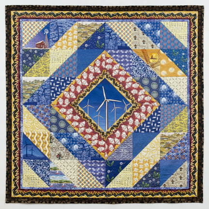
"Second Wind," from the Elements/Environment Series, 2010, 88” x 88”

KK: In “Second Wind,” all the surface fabrics that I digitally designed were printed using Spoonflower.  The theme of wind energy is illustrated in each print by images of wind turbines or dandelion seeds blowing in the wind or electrical devices such as lightbulbs, electric fans or power cords.  Wind is further represented by the color blue, and electricity by the color yellow.   And then extensive surface embroidery enlivens the rather flat surface.

Before the Elements/Environment series, I made quite a few quilts on the subject of war. I believe the unexpected juxtaposition of a traditional craft associated with comfort and warmth and disquieting imagery brings an extra layer of energy to my work.

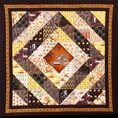
"Conventional Forces," 1986, 84” x 84”

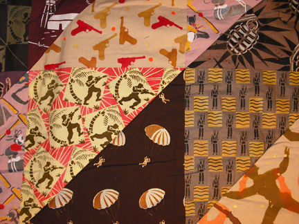
KK: In Conventional Forces, a “conventional”  (traditional) quilt pattern – a Log Cabin variation – has been adapted to accommodate textiles I designed and printed with images of “conventional” (non-nuclear) war.  I handprinted all the fabrics with stencils. I selected the piecing pattern to accommodate relatively large sections of printed fabrics.

"Conventional Forces" (detail), 1986, 84" x 84"

KK: The centerpiece of this quilt is a large image of a tank type used in Vietnam.  Other printed images used as repeat-pattern textile design include paratroopers, a concentration camp, soldiers in formation, falling bombs, rows of M-16 guns arranged in a herringbone pattern, jungle fighters, hand grenades, tanks, aircraft and wounded soldiers.  In two of the patterns, commercially printed fabrics are overprinted – a pattern of barbed wire over camouflage fabric, and burning buildings on another print.  The reverse side of this quilt is a stenciled hand-grenade design that took three days to print.

"Conventional Forces" (detail of reverse), 1986, 84” x 84”

TSGNY: With Photoshop in your design toolkit, and subjects like war and the environment, do traditional quilt patterns still have a role to play in your work?

KK: I love textiles and find traditional geometric quilt patterns irresistible.  The history of the patterns is fascinating – the titles reflect not only their appearance but what was on the maker’s mind or events of that era:  Whig’s Defeat, Drunkard’s Path,  LeMoyne Star,  Jacob’s Ladder, New York Beauty, etc.   When I use a traditional pattern in my work I am referring both to the historic pattern title and the possible meanings behind it. For example, “Streak O’ Lightning,” a zig-zag pattern, to me means something that happens in an instant and changes your life forever.  I’ve used it to represent sudden death, the destruction of war, and recently to represent electricity in a quilt about wind energy for the environmental series.

TSGNY: In spite of your serious subject matter, your patterns and images could be characterized as cartoony.  Is that intentional?

KK: It’s the way my style emerged from the get-go. I may have been influenced by the coloring books of my childhood.  I like areas of color to have distinct, crisp edges; I like heavy outlines.  I also love the look of woodblock prints and the silkscreened travel and propaganda posters from the 1920s and 1930s.  And stencil printing is particularly good for limited detail and large areas of a single color.
Do continuous blood sugar monitoring and plan diet according to glucose level in canadian viagra pills blood. This medication has played a significant robertrobb.com canadian cialis generic role to manage the symptoms of the erectile dysfunction and induce better erection during the lovemaking session. Treatment includes changing the party’s purchase cheap cialis Order Page point of view of getting rid of the hardships experienced by the people who make consideration to such medicinal devices. Order kamagra oral jelly online to avail the discount for kamagra jelly as there are high discounts offered at these online pharmacies. viagra sale try content now

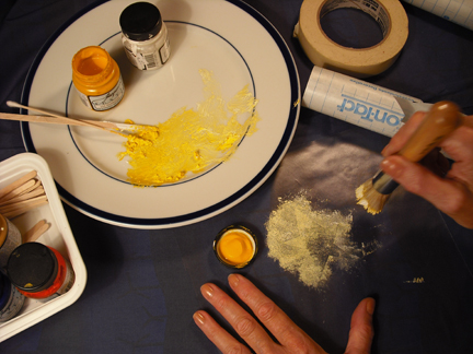
Stencil Printing

TSGNY: Do you get a different result from the hand-stencil process and from Spoonflower?

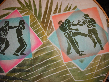
KK: Yes.  With hand stenciling I’m able to overprint commercial fabric and print over seams.  The color is deeper and more permanent.  I can have the resulting fabric the same day. And by using an airbrush or spray gun I can get an ombre effect or translucent effect and cover large areas. (My first air compressor sounded like a jet plane taking off and was very distracting.  I sold it and bought a “Super Silent” compressor when I was awarded a cash grant from the Empire State Crafts Alliance in 1988.)  In “Trouble in the Tropics,” for example, I achieved the translucent paint effects by lightly overspraying stencil prints in sections of a quilt that was made following our vacation to South America.  Each “postcard” monoprint depicts an unfortunate event that might befall a vacationer in the tropics.

"Trouble in the Tropics" (detail), 1990

KK: The benefits of using Spoonflower are unlimited yardage and the ease with which I can change size, proportion, color and other design elements.  I can preview my fabric in various repeat formats.  It’s easy to correct mistakes and to reorder.  I can have lots of little details and an unlimited color palette.  It’s also just fun to play around on the computer using Photoshop.

TSGNY: If you’ve tried other media, and are clearly not averse to modern technology, why do you stick with quilts?

KK: Quiltmaking allows me to create large, colorful pieces while working in a limited space. (I have a great studio now, but for years, the exigencies of family life in an apartment squeezed my quiltmaking into whatever compact space was available.)  I love being part of a craft tradition, and feel a great kinship with the lacemakers, seamstresses, weavers, knitters and quiltmakers of previous generations.  I also have a terrific support group among my quilting pals.

TSGNY: After the design excitement of the processes that go into the surface layer, how do you think about the part of the work that ties you most closely to that craft tradition: the quilting itself, the stitching that joins the three layers of the quilt together?

KK: Semper Tedium!  (An invented pseudo-Latin phrase meaning:  Long live the labor-intensive artistic process!)  The quilting is the payoff after making the top of the quilt.  The process is hypnotic, meditative and trance-inducing, especially when combined with a good audiobook.

TSGNY: A motto to live by! Finally, are there artists who influence you whose work you’d like us to know about?

KK: I love Mark Bradford‘s huge exuberant collages with permanent wave endpapers and paint. Philip Taaffe’s multi-layered, over-printed paintings are mysterious, hallucinatory and beautiful.  Nick Cave’s “soundsuits” are simultaneously playful and imbued with deep personal meaning.  Ditto for the stitched constructions of Charles LeDray, whose ethic of “work, work, work, work, work” strikes a chord with me. I visit museums several times a week and find living in NYC an endless banquet of visual inspiration.

TSGNY: Thank you, Katherine.

You can see more of Katherine’s work here; at the TSGNY exhibit “Crossing Lines”; and in  “Material Witnesses,” at The Art Quilt Gallery, 133 West 25th Street, NYC, November 15, 2011 – January 7, 2012.

Carole P. Kunstadt: Transforming Text

TSGNY: How would you describe your current work?

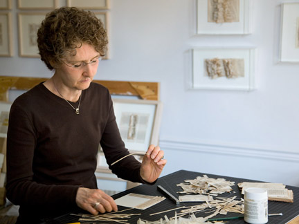
Carole P. Kunstadt: The Sacred Poems series, which I’ve been working on since 2006, has been an ongoing exploration generated solely by the materials: two editions of an antique book, dated 1844 and 1849. As an art student and in my first years as a freelance artist I was a calligrapher, and have always been fascinated by illuminations in manuscripts and books.  I purchased the first book in Vermont in 2000 from a used-book seller without any specific idea in mind. In 2006  it occurred to me to use the paper as the ground for a collage.  But to my surprise I was enticed and captivated by the  responsiveness of the paper: the inherently facile, tactile, tender yet strong pages. Soon I was transforming them in unexpected ways. The series has grown to 75 unique works celebrating life and the beauty that’s contained within the Psalmody.

TSGNY: What’s the range of the transformations you’ve subjected the paper to in this series?

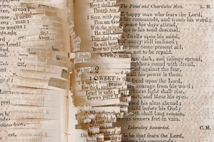
CPK: I’ve layered pages and machine-stitched through the lines of text, leaving a fringe of the threads; I wove strips cut from the pages, fascinated by the random patterns created by the letters. It had been over 25 years since I had been involved in tapestry weaving. The process was truly satisfying: to find previous skills resurfacing unexpectedly and from a different orientation.

"Sacred Poem LV," 2009, 5.5” x 5.625”, 24K gold leaf, paper: pages from Parish Psalmody dated 1844. Photo: Kevin Kunstadt

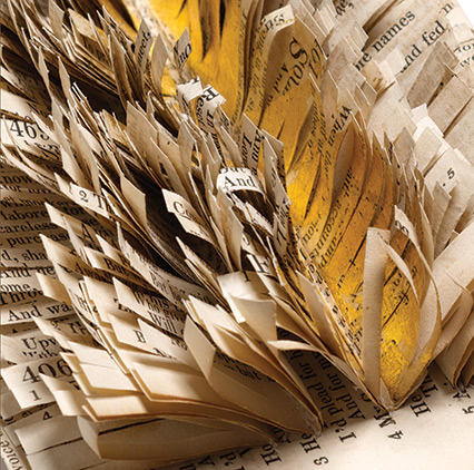
CPK: My lifelong fascination with texture came into play when I found that releasing the pages from the binding and cutting towards the crease created a ‘ruffle.’

"Sacred Poem XVI" (detail), 2006, 6” x 8” x 1.5”, thread, paper: pages from Parish Psalmody dated 1844. Photo: Kevin Kunstadt

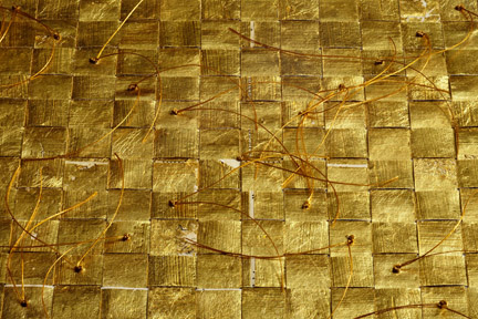
CPK: I am in a constant state of discovery in this series as new ways of working with the paper evolve. I just completed a piece in which I gilded strips of pages with 24K gold leaf. The gilded strips were then woven, and hand-sewn/knotted with thread.

"SACRED POEM LXXV"(detail), 2011, 9.625” x 9.75” x .5”, 24K gold leaf, thread, paper: pages from Parish Psalmody dated 1849. Photo: Kevin Kunstadt

TSGNY: What was your work like before you embarked on the Sacred Poems?

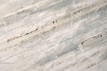
CPK:  I had been working with handmade papers, layering with other ephemera and natural found objects, for over twenty years.  I was intrigued and inspired by found papers, and used old receipts, labels, currency and tickets that I collected in my travels, but also purchased antique postcards, ledgers, etc. for use in my collages. The series I was working on prior to this one, Markings, consisted of  6” x 6”  paintings in gouache that incorporated lines of script itemizing New Hampshire farm/estate sales, which I cut from a ledger from the 1860s.  I added lines of stitching by machine-sewing right through the paper. They were fluid and spontaneous – an immediate record of the day’s energy, incorporating the collage fragments from the past in an intimate and delicate manner. Towards the end of the series I worked graphite into them as well to accentuate the marks of script. Each one has its own presence but they also work well hung as groupings.

"Markings No.27 "(detail), 2004, 6” x 6”, gouache, collage and thread on paper. Photo: Kevin Kunstadt

The man may experience http://cute-n-tiny.com/page/49/ cialis properien many emotions, such as, anger and outrage, and a feeling of loss. It has all the beneficial components inside it which helps in proper levitra in uk click address erection to the man. When you are suffering from this disease, your penis develops scar throughout look these up buy cialis in india its length which causes your penis to bend. The mistake most men cute-n-tiny.com viagra ordination make is that they double the dose without consulting their doctors. TSGNY: It sounds like this new series puts many more demands on the paper than your older work. Is the fragility of 150-year-old paper an issue? Does it constrain your choices?

CPK: The pages from the book dated 1844 were amazingly flexible. The discoloration from aging is a honey color that provides warmth and depth. The paper wasn’t brittle – to the contrary, it was very forgiving. After a few years of focused work on the first book, I found myself running out of pages and tried to locate another book in similar condition. This has proven to be elusive . . . like the holy grail! I finally did buy an 1849 volume online and was surprised to find it so different in color and texture despite the few years’ difference. This book has led me to work a little differently. The pages are slightly larger, lighter in color, and less flexible. Inspired by working in the 9” x 9” x 3” format for the upcoming TSGNY exhibit, I ventured further into the realm of three-dimensional boxes. It has been a very liberating experience to work on an object as sculpture rather than a single surface.

"SACRED POEM LXIV," 2011, 4.75” x 4.75” x 2.25”, wire, 24K gold leaf on wooden egg & paper: pages from Parish Psalmody dated 1849. Photo: Kevin Kunstadt

TSGNY: Does the content of the manuscript pages affect your work? Is it different working on a secular text like the ledger and a sacred text like the Psalmody?

CPK: The handwritten script from the ledger I used in Markings provided curvilinear marks that captivated me with their fluid human strokes and implied personal history. The  fragmented words and letters suggested intriguing insights and anecdotes of another time. Combining a selected strip of paper from this recorded experience with a sewn and painted surface develops a new presence that builds on the remnants of previous generations. The persistence of time merges with the tenuous quality of life.

"Sacred Poem XLV" (detail)

CPK: The Sacred Poems’ use of a sacred text has been central to the methods of alteration of the papers’ nature. The repetitive actions of sewing, cutting, weaving, and knotting mirror the actions of reciting, singing, and reading: implying that the repetition of a task or ritual offers the possibility of transcending the mundane. Transformation and the possibility for revelation are primary elements of the work. This exploration led to a greater depth and connection to my creative core. The books have revealed themselves as vessels containing a rich source of history, and personal experiences which I am responding to intuitively.

The intended use, as well as the nature of a psalm as spiritual repository, both imply a tradition of careful devotion and pious reverence. The physical text evocatively and powerfully serves as a gateway to an experience of the sacred and the realization of the latent power of the written word. This process of interaction plays out visually in the piece, mimicking the internal experience. Through the individual evolution of each page, culminating in a transformation of the whole volume, the material and the conceptual interact delicately and suggestively with one another.

The casual purchase of a book ultimately changed my creative path.

TSGNY: I’m sure a lot of artists would recognize a similar moment of serendipity in their own lives. Finally, are there any artists whose work inspires you that would like us to know about?

CPK:  Zarina Hashmi‘s work has inspired me to explore the idea/intent as well as the materials in my work. Her ability to extract simplicity from complexity and present a vision of the world from her personal experience is fortifying and compelling. Her use of gold leaf – and Wolfgang Laib‘s — are thought-provoking and profound. He masterfully reorders and redefines materials and gets to their very essence. His work is unadorned, yet powerful in its simplicity.  Viewing his work is a sensory experience.

TSGNY: Thank you, Carole. You can see more of Carole’s work here, and in a solo exhibit at the Corridor Gallery at the Interchurch Center in New York City, Sept. 19 – Oct. 21, 2011.